UX improvement & UI make up for one of the most visited pages of Endodontics for the global e-commerce store founded in 1844
The Client
A global e-commerce store - SS White Dental employs over 250 employees and offers worldwide distribution of dental products. The corporate roots are found in the history of Samuel Stockton White, who began as an apprenticing dentist and ventured into his own business in 1844, manufacturing porcelain teeth in Philadelphia, PA. The company still bears the name of its founder and strives to bring the same cutting-edge dental products to market.
SS White Dental sought development for their dental eCommerce store. They reached out to our agency for assistance with Magento development for their eCommerce store. Due to the complexity and thousands of orders each day received, SSWhite decided to make improvements to the website in steps rather than performing a complete redesign. This time we have started to work on section Endodontics.
Identifying The Problem
The original e-commerce website was built on an old platform with limited functionality and not enough customization options. It featured static design elements that were limited to a single rectangular space. With few products on display, small images, and very little movement, the website felt like a disservice to the company.
Tailoring Approach
With low return on email advertising spending and high cost per click, the PPC strategy that SS White Dental utilized was ineffective in competing against bigger brands. In addition, the company was facing decreased sales as a negative consequence of anti-COVID measures. The redesign with UX improvements was necessary. As well as new ads directly on the website.
The website was not spider accessible, mobile-friendly, or secure. It faced issues with broken links and incomplete meta tags, 404 errors, and more, along with content that wasn’t driving traffic for specific dental products, like a rotary file. In addition, the volume of content was insufficient to bring in new leads.
Successful Results
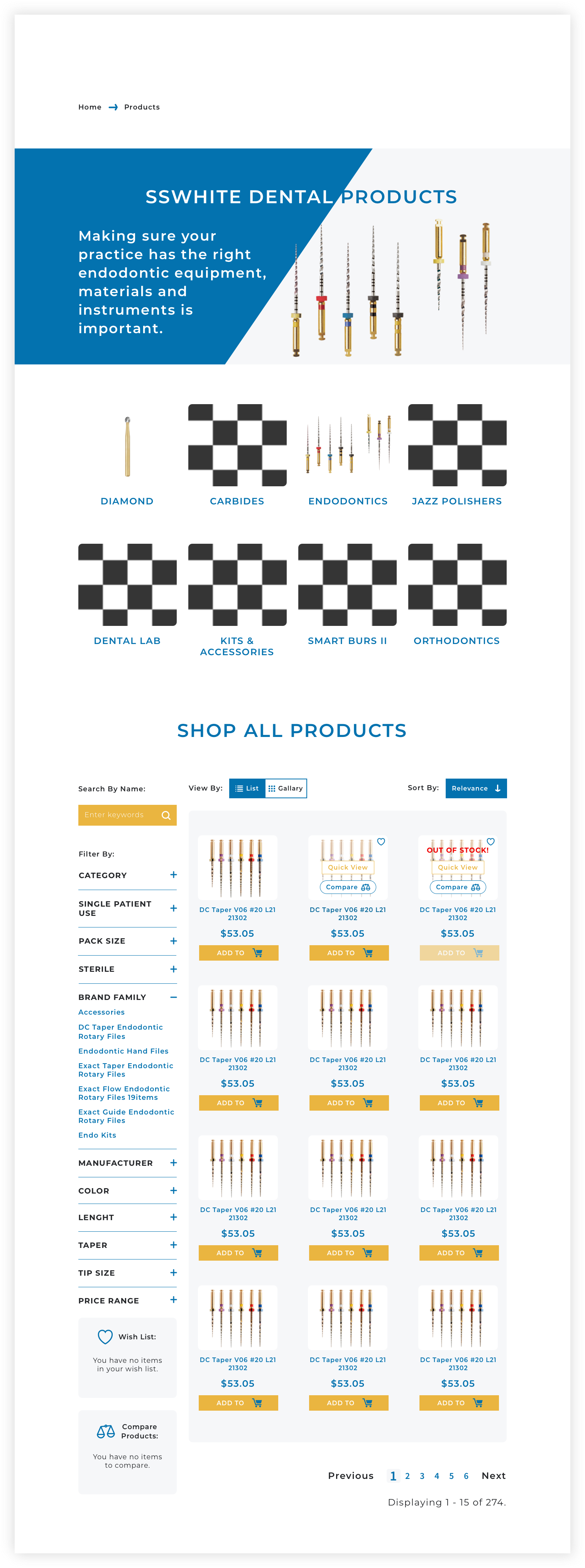
A client-friendly website that prioritized sales and an enhanced user experience. We incorporated negative space and clean, simple fonts that elevated the overall look and feel of the brand.
The header has been changed and new sections to promote relative products were added.
We have added high-resolution images and categories below. The user journey has become smooth and straightforward after breadcrumbs have been added along with the correct subcategories under the category they belong.
We have created new ads, and new banners on the website and tracked its success using AB tests.
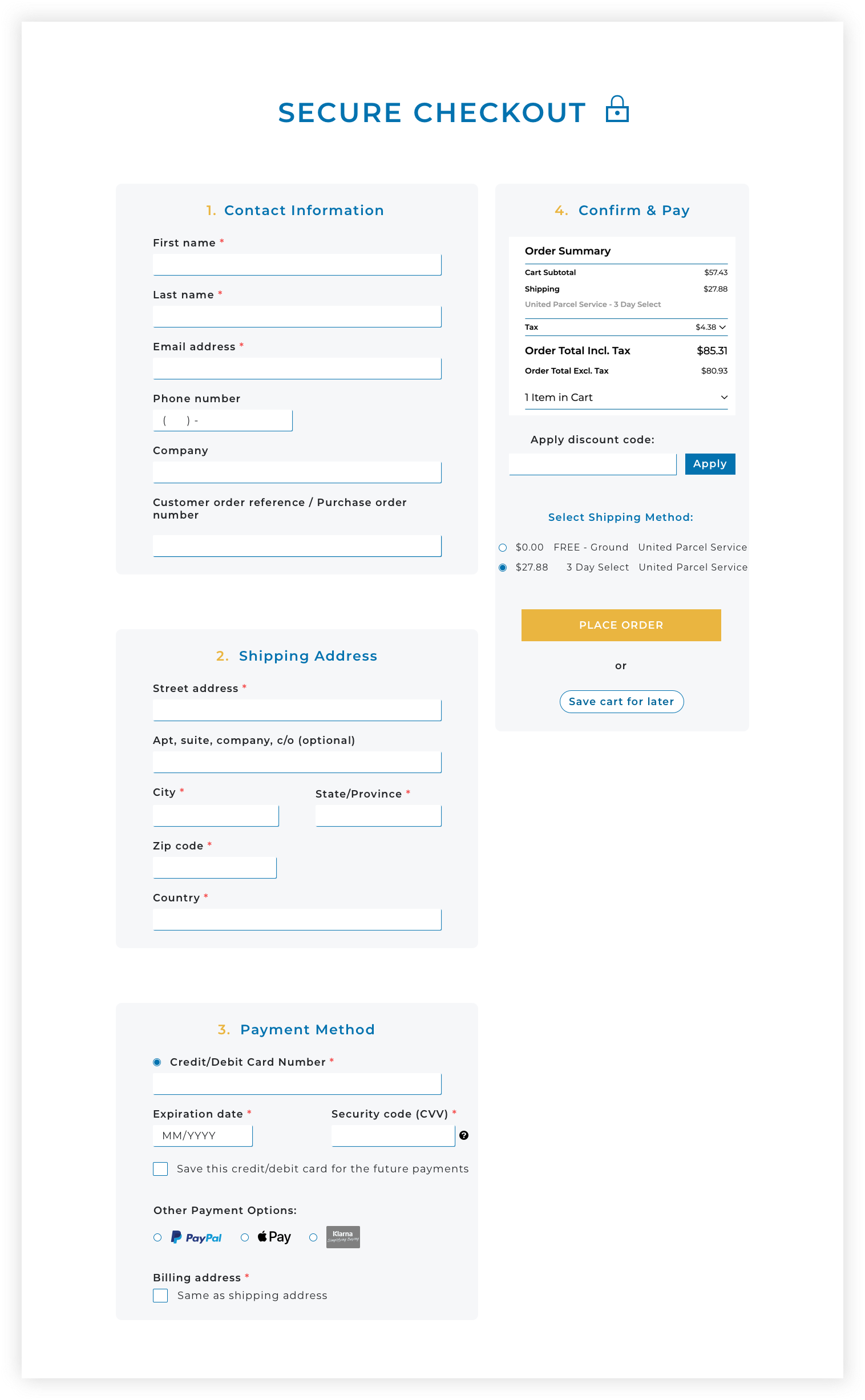
We have created a new, secure one-page checkout and many other changes that influent the success.
With the new call-to-action buttons strategically woven throughout the pages, customers can now easily navigate each page and find everything they want. The end result is not only a huge success for our agency, but for one of the largest endo e-commerce businesses.


